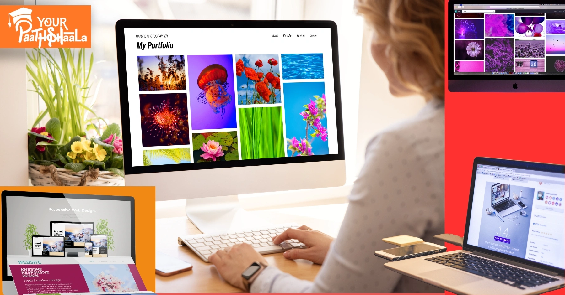
As a graphic designer, I’ve spent years refining my portfolio, learning what grabs attention and what falls flat. Early on, I thought slapping my designs on a white background was enough. Spoiler: it wasn’t. Clients and employers want to see more than just pretty visuals—they want to see how your work lives in the real world. That’s where mockups and real-world context come in. These tools transformed my portfolio from a collection of images into a storytelling powerhouse that landed me gigs. In this article, I’m sharing my experience on how to make your design portfolio stand out using mockups and real-world context, with practical tips to make your work shine.
Why Mockups and Real-World Context Matter
When I started out, my portfolio was a PDF with flat designs—logos, posters, and UI screens—presented without context. I’d get feedback like, “This looks nice, but how does it work in practice?” It stung, but it was a wake-up call. Clients don’t just want to see your design; they want to feel its impact. Mockups and real-world context bridge that gap by showing your work in action—on a billboard, a phone screen, or a product package. They make your portfolio memorable and professional.
Mockups are high-quality, realistic representations of your designs applied to objects like business cards, laptops, or posters. Real-world context goes a step further, showing your work in environments where it would be used, like a website on a tablet in a coffee shop or a logo on a storefront. Together, they elevate your portfolio by:
- Demonstrating application: They show how your design functions in real scenarios.
- Enhancing visual appeal: A mockup is more engaging than a flat PNG.
- Building trust: Clients see you’ve thought about how your work fits into the world.
- Setting you apart: A portfolio with context stands out in a sea of generic submissions.
Let’s dive into how I learned to use mockups and real-world context to make my portfolio pop, with actionable steps you can apply today.
Step 1: Understand Your Audience and Goals
Before I touched a single mockup, I had to figure out who I was designing for. Was my portfolio targeting freelance clients, agencies, or in-house roles? Each audience values different things. Freelance clients might want to see versatile branding projects, while agencies look for niche expertise or bold creativity. Knowing this shaped how I presented my work.
How to Do It:
- Identify your niche: Are you a UI/UX designer, a brand specialist, or a packaging guru? Tailor your mockups to your specialty. For example, as a branding designer, I focused on showing logos on business cards, signage, and product packaging.
- Research your audience: Look at portfolios of designers hired by your dream clients or companies. Notice how they use mockups. For instance, I studied portfolios of designers working with tech startups and saw they leaned heavily on device-based mockups (phones, laptops, tablets).
- Set goals: Are you aiming to land a specific project or showcase versatility? My goal was to attract small business clients, so I prioritized mockups that showed branding in everyday settings, like coffee shop menus or shop windows.
By understanding my audience, I could choose mockups and contexts that resonated with them, making my portfolio feel personal and intentional.
Step 2: Choose the Right Mockups for Your Designs
Early in my career, I made the mistake of using random mockups that didn’t match my projects. A poorly chosen mockup—like a sleek MacBook for a gritty streetwear brand—can make your work look out of place. Over time, I learned to select mockups that complement the design’s style and purpose.
Types of Mockups to Consider:
- Device Mockups: Perfect for UI/UX or web designers. Show your app or website on phones, tablets, or laptops. I once designed a fitness app and used a mockup of a phone held by someone in a gym—it instantly clicked with clients.
- Print Mockups: Ideal for branding or editorial designers. Think business cards, posters, or magazines. For a restaurant branding project, I used a mockup of a menu on a rustic wooden table, which screamed authenticity.
- Product Mockups: Great for packaging or product designers. Show your design on bottles, boxes, or bags. I designed a label for a craft beer and used a mockup of the bottle in a bar setting—clients loved the vibe.
- Environmental Mockups: These show designs in real-world settings, like billboards or storefronts. For a retail client, I placed their logo on a shop sign mockup, making it feel tangible.
Where to Find Quality Mockups:
- Free Resources: Sites like Pexels, Unsplash, or FreePik offer decent free mockups. I started with these to keep costs low.
- Premium Mockups: Platforms like Creative Market, Envato Elements, or Placeit have polished, customizable mockups. I invested in a Placeit subscription when I started getting consistent freelance work—it’s worth it for the variety.
- Create Your Own: If you’re handy with Photoshop or Blender, you can craft custom mockups. I taught myself basic 3D rendering in Blender to create unique product mockups, which gave my portfolio a one-of-a-kind edge.
Pro Tip:
Match the mockup’s aesthetic to your design. A minimalist UI design looks best on a clean, modern device mockup, while a vintage logo shines on a textured paper mockup. Always ensure the mockup doesn’t overshadow your design—it’s there to enhance, not steal the show.
Step 3: Integrate Real-World Context
Mockups are great, but real-world context takes your portfolio to the next level. When I started showing my designs in environments where they’d actually appear, I noticed a shift. Clients weren’t just impressed—they were emotionally connected to the work. A logo on a coffee cup in a cozy café setting feels alive compared to a flat JPEG.
How to Add Real-World Context:
- Tell a story: Think about where your design lives. For a music festival poster, I used a mockup of the poster on a city wall, complete with urban textures and lighting. It made clients envision the poster in their city.
- Use lifestyle mockups: Show your work in use. For a mobile app, I used a mockup of someone holding a phone while jogging—it showed the app’s purpose in action.
- Consider the environment: Match the context to the brand’s vibe. A luxury brand logo looks stunning on a high-end shopping bag in a boutique setting, while a nonprofit’s flyer works well in a community center mockup.
- Incorporate motion: If your portfolio is digital, consider animated mockups. I used Placeit to create a short video of a website scrolling on a tablet, which added a dynamic touch to my portfolio site.
My Favorite Trick:
I love using “scene” mockups—mockups that include multiple elements, like a desk with a laptop, phone, and coffee cup, all showcasing different parts of a branding project. For a café client, I showed their logo on a cup, their menu on a tablet, and their business card on a table. It told a cohesive story and made the project feel complete.
Step 4: Balance Quality and Quantity
One mistake I made early on was overloading my portfolio with too many projects, each with a dozen mockups. It overwhelmed viewers. Over time, I learned that a portfolio with 6–10 strong projects, each with 2–4 carefully chosen mockups, is far more effective than a bloated gallery.
How to Curate Your Portfolio:
- Quality over quantity: Choose your best work. I only include projects that showcase my skills and align with my target audience. If a project feels weak, I leave it out, no matter how much I like it.
- Vary your mockups: Don’t use the same laptop mockup for every UI project. Mix it up with different devices, angles, and settings to keep things fresh.
- Show process (sparingly): Occasionally, I include a flat design alongside a mockup to show my thought process, but I keep it minimal to avoid clutter.
- Keep it cohesive: My portfolio has a consistent visual style—clean, modern, with neutral backgrounds—so the mockups don’t clash. This makes the portfolio feel polished.
Step 5: Optimize for SEO and Accessibility
As a freelancer, I rely on my portfolio website to attract clients, so SEO is a big deal. I also want my portfolio to be accessible to everyone, including potential clients with disabilities. Here’s how I make my portfolio SEO-friendly and accessible while using mockups and real-world context.
SEO Tips for Your Portfolio:
- Use keyphrases naturally: My main keyphrase, “design portfolio stand out,” is woven into headings, captions, and alt text. For example, I might caption a mockup: “Branding design portfolio stand out with a logo on a coffee shop sign.”
- Optimize image alt text: Every mockup image has descriptive alt text, like “Minimalist logo design on a business card mockup for a tech startup.” This helps search engines understand the content and improves accessibility.
- Fast-loading images: High-resolution mockups are great, but they can slow down your site. I use tools like TinyPNG to compress images without losing quality.
- Add project descriptions: For each project, I write a short paragraph explaining the client’s needs, my process, and how the mockup showcases the design. This adds context and boosts SEO with relevant keywords.
- Mobile-friendly design: Many clients browse portfolios on their phones, so I ensure my site is responsive. Mockups look just as good on a phone as they do on a desktop.
Accessibility Tips:
- High-contrast mockups: I avoid low-contrast designs that are hard to read, especially for UI mockups. If the design itself is low-contrast, I choose a mockup with a clear background.
- Screen reader compatibility: I use semantic HTML and ARIA labels on my portfolio site to make it navigable for screen reader users.
- Keyboard navigation: My portfolio site is fully navigable via keyboard, which I test regularly to ensure inclusivity.
Step 6: Showcase Your Process and Problem-Solving
Clients love seeing how you think, not just what you produce. I started including brief case studies in my portfolio to show the “why” behind my designs. Mockups and real-world context help tell this story visually, but a little text goes a long way.
How to Show Your Process:
- Explain the problem: For a branding project, I might write, “The client needed a logo that felt modern yet approachable for their eco-friendly product line.”
- Highlight your solution: “I designed a minimalist logo and used a mockup on a reusable water bottle to show its versatility.”
- Include mockups strategically: I use mockups to illustrate key moments in the project. For a website redesign, I showed the homepage on a laptop mockup and a mobile version on a phone mockup to demonstrate responsiveness.
- Keep it concise: My case studies are 100–200 words, just enough to give context without boring the viewer.
This approach not only makes your portfolio more engaging but also shows you’re a problem-solver, not just a pixel-pusher.
Step 7: Keep Your Portfolio Fresh
Design trends evolve, and so should your portfolio. I revisit mine every 3–6 months to update mockups, swap out old projects, and refresh the look. Recently, I noticed 3D mockups and immersive scenes were trending, so I updated a few projects to include them. This keeps my portfolio relevant and shows I’m in tune with the industry.
Tips for Staying Current:
- Follow design trends: Browse Dribbble, Behance, or Awwwards to see how top designers are using mockups. I noticed holographic and isometric mockups were gaining traction, so I experimented with them for a tech client.
- Update mockups: If a mockup looks dated (like an old iPhone model), swap it for a newer one. I replaced a 2018 MacBook mockup with a 2025 model to keep things sleek.
- Add new work: As you complete projects, add them to your portfolio. I always prioritize projects that let me experiment with unique mockups or contexts.
- Test and iterate: Ask for feedback from mentors or peers. I once showed my portfolio to a senior designer who suggested I simplify my layouts—best advice ever.
Common Mistakes to Avoid
I’ve made plenty of mistakes building my portfolio, and I want you to avoid them. Here are the big ones:
- Overusing mockups: Too many mockups per project can overwhelm. Stick to 2–4 per project.
- Ignoring brand consistency: If your portfolio’s branding (fonts, colors) clashes with your mockups, it looks unprofessional. I use a consistent color palette across my site.
- Low-quality mockups: Blurry or pixelated mockups scream amateur. Always use high-resolution files.
- Forgetting the user: If your portfolio is hard to navigate or slow to load, clients will bounce. I test my site’s speed and usability monthly.
- Neglecting context: A mockup without a story is just a pretty picture. Always explain why the design matters.
Tools and Resources I Use
Here’s a rundown of the tools that have helped me create standout mockups and real-world context:
- Adobe Photoshop: For editing and placing designs into mockups. I use smart objects for quick updates.
- Placeit: A lifesaver for professional mockups and animated scenes. Their library is massive.
- Canva: Great for quick mockups if you’re not a Photoshop pro. I use it for simple print mockups.
- Blender: For custom 3D mockups. It has a learning curve but adds a unique touch.
- Figma: Perfect for UI/UX mockups and creating responsive design previews.
- TinyPNG: For compressing images to keep my site fast.
- Behance/Dribbble: For inspiration and to see how others use mockups.
My Results and Final Thoughts
After incorporating mockups and real-world context, my portfolio went from forgettable to a client magnet. Within months, I landed three freelance branding projects and got shortlisted for an agency role—all because my work felt tangible and professional. Clients commented on how they could “see” their brand coming to life, which was exactly the reaction I wanted.
To make your design portfolio stand out, focus on quality, context, and storytelling. Choose mockups that enhance your designs, show them in real-world settings, and pair them with concise case studies. Keep your audience in mind, optimize for SEO and accessibility, and refresh your portfolio regularly. It’s not just about showing your skills—it’s about showing how your work makes an impact.
Start small: pick one project, find a mockup that fits, and place it in a real-world context. Test it with a friend or mentor and see how it feels. From there, build out your portfolio with intention, and you’ll be amazed at the response. Join YourPaathshaala, Raipur’s leading skill development institute. Contact us at 📞 +91-8305209520 for more information!




Add a Comment