


Have you ever looked at a beautiful magazine page, website, or poster and wondered what makes it look so professional and appealing? The secret isn’t just good colors or fonts – it’s how everything is arranged on the page. This arrangement is called layout and composition, and it’s one of the most important skills in design.
Layout and composition for beginners might seem overwhelming at first, but it’s really about understanding how to organize elements so they work together beautifully. Whether you’re creating a business card, designing a presentation, or building a website, mastering layout and composition will transform your work from amateur to professional.
The best part? You don’t need expensive software or artistic talent to create great layouts. You just need to understand some basic principles that have been guiding designers for centuries.
What Are Layout and Composition?
Layout and composition are closely related but slightly different concepts. Let’s break them down:
Layout is the arrangement of elements on a page or screen. It’s about where you place your text, images, buttons, and other design elements. Think of it as organizing the furniture in a room – you want everything to fit well and serve its purpose.
Composition is the overall visual structure of your design. It’s about how all the elements work together to create a unified, pleasing whole. If layout is arranging the furniture, composition is making sure the room feels balanced and harmonious.
Together, layout and composition for beginners help you create designs that are not only beautiful but also functional and easy to understand.
Why Layout and Composition Matter
Good layout and composition serve several important purposes:
They Guide the Eye – A well-composed design leads viewers through your content in a logical order, making sure they see the most important information first.
They Create Hierarchy – Layout helps establish what’s most important, what’s secondary, and what’s supporting information.
They Improve Readability – Proper spacing and organization make text easier to read and understand.
They Communicate Professionalism – Clean, organized layouts make you and your message appear more credible and trustworthy.
They Enhance Understanding – Good composition helps people process information more quickly and accurately.
The Rule of Thirds: Your Layout Foundation
The rule of thirds is perhaps the most important concept in layout and composition for beginners. Imagine dividing your page into nine equal sections with two horizontal and two vertical lines, like a tic-tac-toe grid.
Instead of centering everything, try placing important elements along these lines or at their intersections. This creates more dynamic, interesting compositions than simply centering everything.
For example, instead of putting a photo right in the center of your page, try placing it along one of the vertical lines. Instead of centering your headline, try aligning it with one of the horizontal lines.
The rule of thirds works because it creates natural balance and movement in your design. It’s based on how our eyes naturally scan and process visual information.
Understanding Visual Weight and Balance
Visual weight is how much attention different elements attract. Some things naturally feel “heavier” than others, and understanding this is crucial for layout and composition for beginners.
What Creates Visual Weight?
Size – Bigger elements feel heavier than smaller ones. A large headline has more visual weight than small body text.
Color – Bright, saturated colors feel heavier than muted ones. Red feels heavier than light gray.
Contrast – High contrast elements stand out more and feel heavier. Black text on white background has more weight than gray text.
Density – Areas with lots of elements feel heavier than empty areas. A paragraph of text feels heavier than white space.
Position – Elements at the top or right of a page feel heavier than those at the bottom or left.
Types of Balance
Symmetrical Balance – Elements are arranged equally on both sides of an imaginary center line. This creates a formal, stable feeling but can sometimes feel boring.
Asymmetrical Balance – Elements are different on each side but still feel balanced through careful arrangement of visual weight. This creates more dynamic, interesting compositions.
Radial Balance – Elements are arranged around a central point, like spokes on a wheel. This creates focus and movement toward the center.
Grid Systems: Your Layout Framework
Grids are invisible frameworks that help you organize elements consistently. Think of them as the skeleton of your design – they provide structure that your content can hang on.
Why Use Grids?
Grids help you:
- Align elements consistently
- Create visual rhythm and flow
- Maintain proportions
- Speed up your design process
- Create professional-looking layouts
Types of Grids
Single Column Grid – One column of content, like a basic document or simple webpage. This is great for text-heavy content and mobile designs.
Multi-Column Grid – Two or more columns, like newspapers or magazines. This allows for more complex layouts and better use of space.
Modular Grid – A grid divided into modules or boxes. This is perfect for organizing different types of content, like product catalogs or photo galleries.
Baseline Grid – A grid based on the height of your text lines. This ensures consistent vertical spacing throughout your design.
Using Grids in Layout and Composition for Beginners
Start with simple grids and gradually work up to more complex ones. Many design programs have built-in grid systems, or you can create your own by drawing guidelines.
Remember that grids are meant to help, not restrict you. It’s okay to break the grid occasionally for emphasis or visual interest – just do it intentionally.
White Space: The Unsung Hero
White space (also called negative space) is the empty area around and between elements. It’s not wasted space – it’s a powerful design tool that’s essential for good layout and composition for beginners.
Why White Space Matters
It Improves Readability – Space around text makes it easier to read and process.
It Creates Focus – Elements surrounded by white space naturally draw more attention.
It Suggests Quality – Generous white space often makes designs feel more premium and sophisticated.
It Provides Rest – White space gives viewers’ eyes a place to rest, preventing visual fatigue.
It Defines Relationships – Elements close together feel related, while elements separated by white space feel distinct.
Using White Space Effectively
Don’t try to fill every inch of your design. Embrace emptiness and use it strategically. Sometimes what you don’t include is as important as what you do include.
Consider the margins around your content, the space between paragraphs, and the padding around buttons and images. All of these contribute to the overall feeling of your design.
Creating Visual Hierarchy
Visual hierarchy is about organizing information in order of importance. It’s like creating a roadmap for your viewers’ eyes, showing them where to look first, second, and third.
Tools for Creating Hierarchy
Size – Make important elements bigger. Your main headline should be the largest text on the page.
Color – Use bright or contrasting colors to highlight important elements. Make less important elements more subtle.
Position – Place important elements where people naturally look first (usually the top-left for Western audiences).
Contrast – Make important elements stand out through contrast in color, size, or style.
Spacing – Give important elements more space around them to make them feel more significant.
The F-Pattern and Z-Pattern
Research shows that people scan content in predictable patterns:
F-Pattern – Common for text-heavy content. People read the top line, scan down the left side, then read horizontally again. This pattern looks like the letter F.
Z-Pattern – Common for simpler layouts. People look at the top-left, scan across the top, diagonally down to the bottom-left, then across the bottom. This creates a Z shape.
Understanding these patterns helps you place important elements where people are most likely to see them.
Alignment: Creating Order from Chaos
Alignment is one of the most important principles in layout and composition for beginners. It’s about lining up elements to create visual connections and organization.
Types of Alignment
Left Alignment – Elements line up along their left edges. This is the most common and readable alignment for text.
Right Alignment – Elements line up along their right edges. This creates a more formal, sophisticated feeling.
Center Alignment – Elements are centered on an imaginary vertical line. This works well for headlines and short text but can be hard to read for long paragraphs.
Justified Alignment – Text lines up on both left and right sides. This creates a clean, formal look but can sometimes create awkward spacing.
Creating Invisible Lines
Good alignment creates invisible lines that connect elements and create order. Even if elements aren’t touching, aligning them creates visual relationships that make your design feel cohesive.
Proximity and Grouping
Elements that are close together feel related, while elements that are far apart feel separate. This principle, called proximity, is crucial for layout and composition for beginners.
Using Proximity Effectively
Group Related Information – Put related content close together. Contact information should be grouped, navigation items should be close to each other, and related images should be near each other.
Separate Unrelated Information – Use space to show that different sections are distinct. Don’t let your footer content bump into your main content.
Create Logical Chunks – Break up large amounts of information into smaller, digestible groups.
Contrast: Making Things Stand Out
Contrast is about making elements different from each other. It’s essential for creating visual interest and helping important information stand out.
Types of Contrast
Size Contrast – Big vs. small elements create emphasis and hierarchy.
Color Contrast – Different colors make elements distinct and can create mood.
Shape Contrast – Mixing geometric and organic shapes creates visual interest.
Texture Contrast – Smooth vs. rough textures add depth and variety.
Style Contrast – Mixing different styles (like modern fonts with vintage images) can create unique effects.
Using Contrast Wisely
Contrast should serve a purpose. Don’t make things different just to be different – make them different to communicate something important or to improve the user experience.
Repetition: Creating Unity
Repetition is about using similar elements throughout your design to create unity and consistency. It’s like a visual rhythm that ties everything together.
What to Repeat
Colors – Use the same colors throughout your design to create cohesion.
Fonts – Stick to a limited number of fonts and use them consistently.
Spacing – Use consistent margins, padding, and gaps between elements.
Shapes – Repeat similar shapes or styles to create visual connections.
Styles – Use consistent button styles, heading styles, and other design elements.
Repetition in Layout and Composition for Beginners
Start by choosing a few key elements to repeat throughout your design. This might be a particular shade of blue, a specific font size for subheadings, or a consistent amount of space between sections.
Common Layout Mistakes to Avoid
Learning layout and composition for beginners means understanding what not to do as well as what to do.
Centering Everything
While centering can work for headlines or special elements, centering everything makes your design feel static and boring. Mix centered elements with left-aligned or right-aligned ones for more dynamic compositions.
Ignoring Margins
Don’t let your content touch the edges of your page or container. Always leave some breathing room around your design.
Inconsistent Spacing
Random spacing makes designs look unprofessional. Establish a spacing system and stick to it throughout your design.
Too Many Focal Points
If everything is trying to grab attention, nothing will succeed. Choose one or two main focal points and support them with secondary elements.
Poor Image Placement
Images should relate to nearby text and contribute to the overall flow of your design. Don’t just drop images anywhere – place them thoughtfully.
Ignoring the Audience
Consider how your audience will use your design. A poster viewed from a distance needs different layout choices than a mobile app used up close.
Layout for Different Media
Layout and composition for beginners should consider where the design will be used. Different media have different requirements and opportunities.
Print Layout
Print designs are fixed in size and viewed in specific lighting conditions. You can use smaller text and more detailed elements because people can hold the material closer and examine it carefully.
Consider how the design will be printed and bound. Will it be a single sheet or a booklet? Will it be folded? These factors affect your layout decisions.
Web Layout
Web layouts need to work on different screen sizes and devices. This means your layout should be flexible and responsive.
Consider how people interact with web content – they scroll, click, and sometimes print. Your layout should accommodate these behaviors.
Mobile Layout
Mobile screens are small, so your layout needs to be simplified and prioritized. Focus on the most important content and make interactive elements easy to tap.
Consider how people hold and use their phones. Thumbs can’t reach all areas of the screen equally, so place important elements where they’re easy to access.
Tools and Resources for Layout
There are many tools available to help you with layout and composition for beginners:
Design Software
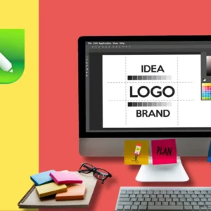
- Canva (beginner-friendly with templates)
- Adobe InDesign (professional layout tool)
- Figma (web-based design tool)
- Sketch (Mac-only design tool)
Grid and Layout Tools
- Grid generators and templates
- Wireframing tools for planning layouts
- Measurement tools for consistent spacing
Learning Resources
- Design blogs and tutorials
- Layout galleries for inspiration
- Books on design principles
Practicing Layout and Composition
Like any skill, layout and composition for beginners improves with practice. Here are ways to develop your skills:
Start Simple
Begin with single-page layouts like flyers or business cards. These constrained formats help you focus on fundamental principles without getting overwhelmed.
Study Good Examples
Look at well-designed magazines, websites, and advertisements. Ask yourself: How is the information organized? What draws your eye first? How do the elements work together?
Try Layout Exercises
Practice arranging the same content in different ways. Take a simple flyer and try creating five different layouts. This helps you understand how layout choices affect communication.
Use Templates Thoughtfully
Templates can be great learning tools, but don’t rely on them forever. Study how template layouts work, then try creating your own variations.
Get Feedback
Show your layouts to others and ask for honest feedback. Fresh eyes can spot problems you might miss and help you understand how others interpret your designs.
The Future of Layout and Composition
Layout and composition for beginners should also consider emerging trends and technologies:
Responsive Design
As screens become more varied, layouts need to adapt fluidly to different sizes and orientations.
Interactive Elements
Modern layouts often include interactive elements like hover effects, animations, and user controls that affect the layout.
Accessibility
Good layout increasingly means considering users with disabilities and ensuring your designs work for everyone.
Sustainability
Digital layouts should consider loading times and energy efficiency, while print layouts should consider environmental impact.
Conclusion
Layout and composition for beginners is really about creating order from chaos. It’s about taking all your design elements – text, images, colors, and shapes – and arranging them in a way that’s both beautiful and functional.
Remember these key principles:
- Use grids to create structure and consistency
- Embrace white space as a design element
- Create clear visual hierarchy
- Align elements to create organization
- Use proximity to show relationships
- Apply contrast to create emphasis
- Repeat elements to create unity
The most important thing is to start practicing. Pick a simple project – maybe redesigning a flyer or improving a document – and apply these layout principles. Pay attention to how different arrangements affect the clarity and impact of your message.
Good layout and composition for beginners takes time to develop, but every small improvement makes your designs more effective and professional. Start with the basics, practice regularly, and gradually build your skills.
Remember, the best layouts are invisible – they help people understand and engage with your content without drawing attention to themselves. Focus on clarity and function first, then beauty will follow naturally.
Layout and composition are powerful tools that can transform any design from confusing to clear, from amateur to professional. With practice and patience, you’ll soon be creating layouts that not only look great but also communicate effectively and serve your audience well.
- What are Photoshop Layers? Complete Beginner’s Tutorial with Examples in 2025
 In 2025, mastering Photoshop layers is a must for Indian beginners diving into the $50,000 crore digital… Read more: What are Photoshop Layers? Complete Beginner’s Tutorial with Examples in 2025
 - Beginner-Friendly vs Professional Software: Learning Path Guide in 2025
 In 2025, choosing between beginner-friendly vs professional software is a pivotal decision for Indian beginners entering the… Read more: Beginner-Friendly vs Professional Software: Learning Path Guide in 2025
 - Photoshop vs Illustrator: Which Should I Learn First in 2025?
 In 2025, deciding between Photoshop vs Illustrator to learn first is a critical step for Indian beginners… Read more: Photoshop vs Illustrator: Which Should I Learn First in 2025?
 - CorelDRAW vs Illustrator: Which is Better for Logo Design in 2025?
 In 2025, deciding between CorelDRAW and Illustrator for logo design is key for Indian beginners navigating the… Read more: CorelDRAW vs Illustrator: Which is Better for Logo Design in 2025?
 - What is Figma? Web-Based Design Tool Complete Tutorial in 2025
 In 2025, mastering Figma, a powerful web-based design tool, is a game-changer for Indian beginners navigating the… Read more: What is Figma? Web-Based Design Tool Complete Tutorial in 2025
 - How to Use Illustrator Pen Tool? Mastering Bezier Curves Step-by-Step in 2025
 In 2025, mastering the Illustrator Pen Tool is a game-changer for Indian beginners navigating the $50,000 crore… Read more: How to Use Illustrator Pen Tool? Mastering Bezier Curves Step-by-Step in 2025
Add a Comment