

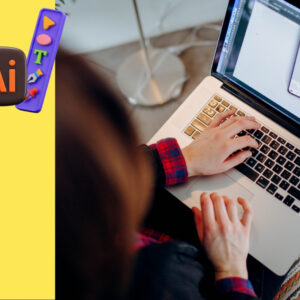
Want your videos to look like they belong on TV? Motion text & lower thirds are the secret to giving your content a polished, professional edge. These dynamic text overlays, titles, and name graphics add style and clarity, making your videos stand out on YouTube, Instagram, or even corporate promos. This beginner-friendly guide walks you through how to create and animate text to achieve that broadcast-quality feel. From crafting eye-catching titles to designing sleek lower thirds, you’ll learn simple steps to elevate your videos. Let’s dive into the world of motion text & lower thirds and make your content shine!
What Are Motion Text & Lower Thirds?
Motion text & lower thirds are animated text elements that enhance your videos. Motion text includes dynamic titles, captions, or overlays that move, fade, or scale to grab attention. Lower thirds are graphics (usually at the bottom of the screen) that display names, titles, or key information, like “John Doe, CEO” in an interview. These elements are common in TV broadcasts, vlogs, and social media videos to add professionalism and context.
This guide will show you how to create motion text & lower thirds that make your videos look sharp and engaging.
Why Motion Text & Lower Thirds Matter
Adding motion text & lower thirds can transform your videos. Here’s why they’re so important:
- Boosts Professionalism: Sleek text makes your videos look polished and broadcast-ready.
- Clarifies Information: Lower thirds introduce people or highlight key points clearly.
- Grabs Attention: Animated text hooks viewers, especially in fast-paced platforms like TikTok.
- Enhances Branding: Use consistent fonts and colors to reinforce your brand.
- Improves Accessibility: Text overlays help viewers understand content without sound.
Whether you’re a YouTuber or a business, motion text & lower thirds take your videos to the next level.
The Building Blocks of Motion Text & Lower Thirds
To create stunning text overlays, you need to understand three key elements: design, animation, and integration. Let’s break them down simply.
1. Design: Create Eye-Catching Text
The look of your text sets the tone. Here’s how to design motion text & lower thirds:
- Choose Readable Fonts: Use bold, clear fonts like Montserrat or Roboto for easy reading.
- Pick Brand Colors: Match text and background colors to your brand or video’s mood (e.g., blue for calm, red for energy).
- Add Backgrounds: Place text on a semi-transparent box or shape for contrast and readability.
- Keep It Simple: Avoid cluttered designs—stick to one or two fonts and minimal graphics.
Pro Tip: Use Adobe Fonts or Google Fonts for free, professional font options.
2. Animation: Bring Text to Life
Animation makes motion text & lower thirds dynamic. Here’s how to animate them:
- Use Simple Motions: Try fades, slides, or zooms for smooth entrances and exits.
- Time It Right: Make text appear when it’s relevant, like a name during an interview.
- Keep It Short: Animations should last 1-2 seconds to avoid distracting viewers.
- Add Easing: Use “easy ease” in editing apps for natural, smooth motion.
Pro Tip: Watch TV news or YouTube vlogs to see how pros animate their text.
3. Integration: Blend with Your Video
Text should feel like part of the video, not an afterthought. Here’s how to integrate motion text & lower thirds:
- Match the Style: Ensure text matches your video’s vibe (e.g., playful for Reels, sleek for promos).
- Position Wisely: Place lower thirds in the bottom third of the screen to avoid covering key visuals.
- Sync with Audio: Time text animations to music beats or voiceovers for impact.
- Test Readability: Ensure text is clear on small screens like phones.
Pro Tip: Preview your video with text on a phone to check size and clarity.
Step-by-Step Guide to Motion Text & Lower Thirds
Ready to add professional text to your videos? Follow these easy steps for motion text & lower thirds.
Step 1: Plan Your Text
Before you start, plan what your text will say and how it’ll look. Ask yourself:
- What’s the Purpose? Are you introducing a person, highlighting a tip, or adding a title?
- What’s the Style? Playful for social media or formal for corporate videos?
- Where Will It Go? Decide if it’s a title at the start or a lower third during a scene.
Write down the text (e.g., “Sarah Lee, Travel Vlogger”) and sketch where it’ll appear.
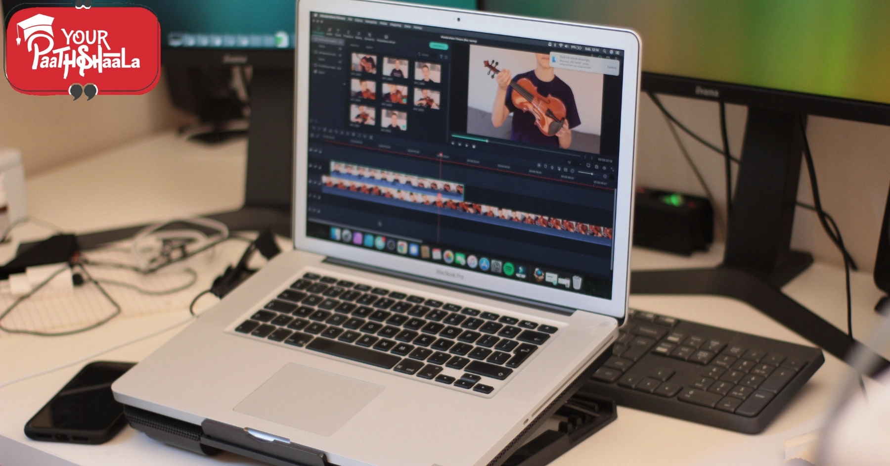
Step 2: Choose Your Tools
You don’t need expensive software to create motion text & lower thirds. Here are beginner-friendly options:
- Free Apps: CapCut, Canva, or VN Video Editor offer built-in text tools.
- Pro Software: Adobe After Effects or Premiere Pro for advanced animations.
- Templates: Use pre-made templates from Envato Elements or Motion Array for quick results.
Pro Tip: Start with free apps to learn the basics before moving to pro tools.
Step 3: Design Your Text
Create your text and lower thirds in your chosen app:
- Add Text: Use the text tool to type your title or lower third (e.g., “New Product Launch”).
- Customize Fonts: Choose a bold, readable font and adjust size for clarity.
- Add Graphics: Include a shape or bar behind the text for a polished look.
- Set Colors: Use contrasting colors (e.g., white text on a dark box) for readability.
Pro Tip: Save your design as a template to reuse across videos for consistency.
Step 4: Animate Your Text
Bring your text to life with animation:
- Choose an Animation: In your app, select a preset like “Fade In” or “Slide Left.”
- Use Keyframes (Pro Tools): In After Effects or Premiere, add keyframes to animate position, scale, or opacity.
- Time It: Make text appear for 3-5 seconds, synced with key video moments or audio beats.
- Add Easing: Smooth out animations with “easy ease” for a natural feel.
Pro Tip: Keep animations subtle to avoid overwhelming viewers.
Step 5: Integrate and Export
Make sure your text fits seamlessly into your video:
- Place Text: Position lower thirds in the bottom left or right corner. Place titles center-screen or at the top.
- Sync with Video: Align text animations with cuts, music beats, or voiceovers.
- Check Readability: Ensure text is clear on small screens and doesn’t block key visuals.
- Export: Use H.264 format with 1080p resolution for platforms like YouTube or Instagram.
Pro Tip: Test your video on a phone to confirm text looks great on mobile.
Motion Text & Lower Thirds for Different Platforms
Each platform has unique text needs. Here’s how to adapt:
1. Instagram Reels and TikTok
- Length: Text appears for 1-3 seconds.
- Style: Bold, colorful fonts with quick animations (e.g., pop-in or zoom).
- Placement: Center or top for captions, bottom for lower thirds.
- Animation: Fast and playful to match the platform’s energy.
2. YouTube Videos
- Length: Text stays on screen for 3-5 seconds.
- Style: Clean, readable fonts with subtle animations (e.g., fade or slide).
- Placement: Lower thirds for names, center for titles or end screens.
- Animation: Smooth and professional to suit longer content.
3. Corporate or Promotional Videos
- Length: Text on screen for 4-6 seconds.
- Style: Sleek fonts with branded colors and minimal graphics.
- Placement: Lower thirds for names/titles, center for intros or promos.
- Animation: Subtle fades or slides for a polished look.
Common Motion Text & Lower Thirds Mistakes to Avoid
Avoid these pitfalls for better text:
- Cluttered Designs: Too many fonts or colors look messy. Stick to simple designs.
- Hard-to-Read Text: Small or low-contrast text is tough to read on phones.
- Overdone Animations: Flashy effects can distract from your video’s message.
- Bad Timing: Text that appears too early or late feels off. Sync it carefully.
Tools for Motion Text & Lower Thirds
You don’t need pro gear to create great text. Try these:
- Editing Apps: Free tools like CapCut, Canva, or VN Video Editor; pro tools like Adobe After Effects or Premiere Pro.
- Templates: Find pre-made lower thirds on Envato Elements, Motion Array, or Canva.
- Fonts: Use free fonts from Google Fonts or Adobe Fonts for professional looks.
- Stock Graphics: Get free shapes or icons from Pexels or Flaticon to enhance designs.
Learning More About Motion Text & Lower Thirds
Improve your text skills with these resources:
- YouTube Channels: Watch Video Copilot or Motion Array for text animation tutorials.
- Online Courses: Skillshare and Udemy offer classes on After Effects and text design.
- Communities: Join Reddit’s r/AfterEffects or r/VideoEditing for tips.
- Practice: Create short videos with different text styles weekly to experiment.
Why Motion Text & Lower Thirds Rock in 2025
As of July 2025, motion text & lower thirds are key to standing out in a crowded video landscape. With short-form content dominating platforms like TikTok and YouTube Shorts, dynamic text grabs attention fast. AI tools in apps like Adobe After Effects (e.g., auto-text animation) and CapCut make creating motion text & lower thirds easier than ever, even for beginners. By adding professional text, you can make your videos look broadcast-ready.
Conclusion
Motion text & lower thirds are your ticket to creating videos with a professional, broadcast feel. By designing clear text, adding smooth animations, and syncing them with your video, you can captivate audiences on any platform. Whether you’re making Reels, YouTube videos, or promos, start with free tools, experiment with animations, and keep it simple. With these tips, you’ll master motion text & lower thirds in no time.
Ready to make your videos pop? Open your editing app and start designing! To learn more about graphic designing practically join our institute YourPaathshaala in raipur or contact us at 8305209520 for more information.
- What are Photoshop Layers? Complete Beginner’s Tutorial with Examples in 2025
 In 2025, mastering Photoshop layers is a must for Indian beginners diving into the $50,000 crore digital… Read more: What are Photoshop Layers? Complete Beginner’s Tutorial with Examples in 2025
 - Beginner-Friendly vs Professional Software: Learning Path Guide in 2025
 In 2025, choosing between beginner-friendly vs professional software is a pivotal decision for Indian beginners entering the… Read more: Beginner-Friendly vs Professional Software: Learning Path Guide in 2025
 - Photoshop vs Illustrator: Which Should I Learn First in 2025?
 In 2025, deciding between Photoshop vs Illustrator to learn first is a critical step for Indian beginners… Read more: Photoshop vs Illustrator: Which Should I Learn First in 2025?
 - CorelDRAW vs Illustrator: Which is Better for Logo Design in 2025?
 In 2025, deciding between CorelDRAW and Illustrator for logo design is key for Indian beginners navigating the… Read more: CorelDRAW vs Illustrator: Which is Better for Logo Design in 2025?
 - What is Figma? Web-Based Design Tool Complete Tutorial in 2025
 In 2025, mastering Figma, a powerful web-based design tool, is a game-changer for Indian beginners navigating the… Read more: What is Figma? Web-Based Design Tool Complete Tutorial in 2025
 - How to Use Illustrator Pen Tool? Mastering Bezier Curves Step-by-Step in 2025
 In 2025, mastering the Illustrator Pen Tool is a game-changer for Indian beginners navigating the $50,000 crore… Read more: How to Use Illustrator Pen Tool? Mastering Bezier Curves Step-by-Step in 2025
Add a Comment