
In 2025, understanding typography hierarchy is essential for Indian beginners creating professional visuals in the thriving $50,000 crore digital market, per IAMAI, ensuring text in designs like posters or social media graphics is clear and engaging. Typography hierarchy organizes text to guide viewers’ attention, making designs visually appealing and easy to read. This beginner-friendly guide explains typography hierarchy and offers practical steps to make text look professional, tailored for India’s vibrant design scene. For example, a well-structured festival ad can attract clients with minimal effort. Whether you’re freelancing in Mumbai or learning in a small town, these insights will elevate your work. Ready to create stunning text? Let’s dive into typography hierarchy in 2025!
What is Typography Hierarchy?
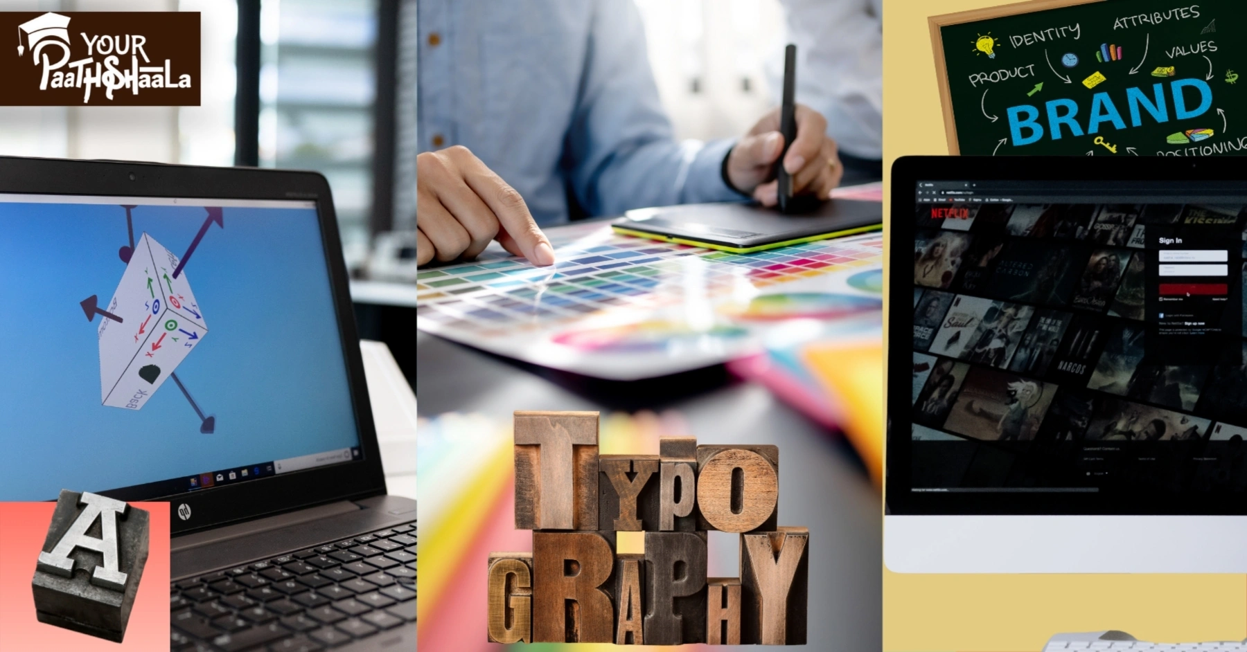
Typography hierarchy in design refers to the arrangement and styling of text to emphasize importance, guide the viewer’s eye, and enhance readability. It uses elements like font size, weight, and spacing to prioritize content, such as headings over body text. In India, where 70% of users access content on mobile (per IAMAI), clear hierarchy is crucial for effective communication. For instance, a bold headline on a Diwali poster grabs attention before smaller details. Mastering typography hierarchy ensures your designs look polished and professional.
Why Typography Hierarchy Matters in Design
Typography hierarchy is critical for creating professional, user-friendly designs. First, it improves readability, helping viewers quickly understand key messages. Next, it enhances visual appeal, making designs stand out in India’s competitive market. For example, a poorly organized poster may confuse viewers, reducing impact. However, incorrect hierarchy can make text cluttered or unappealing. Using typography hierarchy effectively elevates your design quality.
Key Elements of Typography Hierarchy
Typography hierarchy relies on several elements to organize text effectively. Font size differentiates headings (larger) from body text (smaller). Font weight, like bold or regular, emphasizes key information. Spacing, such as line or letter spacing, improves readability on mobile screens. For instance, a bold, large font for a festival ad headline draws attention, per Creative Bloq’s 2025 trends. Combining these elements creates a clear, professional hierarchy.
Benefits of Using Typography Hierarchy
Applying typography hierarchy offers multiple advantages for Indian designers. It ensures clarity, making designs accessible to diverse audiences, including mobile users. It also enhances professionalism, impressing clients with clean layouts. For example, a well-structured business card can win freelance gigs. Additionally, it aligns with 2025 trends favoring minimal, readable designs. Proper hierarchy boosts your reputation in India’s design industry.
Common Typography Challenges in India
Indian designers face unique challenges with typography hierarchy. Mixing multiple scripts, like Hindi and English, requires careful font pairing for clarity. Limited access to premium fonts can restrict creative options for beginners. For instance, a cluttered social media post may fail to engage India’s mobile audience. However, free tools and fonts make hierarchy achievable. Awareness and practice overcome these obstacles.
Top Tools and Fonts for Typography Hierarchy
These beginner-friendly tools and fonts are ideal for creating typography hierarchy in India for 2025:
- Canva: Free or ₹500/month (Pro), offers templates and font pairing for posters.
- GIMP: Free, open-source, supports custom text styling for hierarchy.
- Figma: Free plan, cloud-based for UI/UX text layouts, popular in India.
- Google Fonts: Free, includes Noto Sans Devanagari for Indian scripts.
- Poppins: Free, versatile sans-serif font for modern, clean hierarchy.
These tools and fonts are accessible, helping freshers create professional text layouts.
6 Steps to Create Professional Typography Hierarchy
Follow this beginner-friendly guide to apply typography hierarchy and make text look professional in India for 2025.
1. Learn Typography Basics
Study font size, weight, and spacing using free resources like Canva’s Design School. For example, learn how bold fonts emphasize headlines in festival ads. Spend 2-3 hours weekly on YouTube tutorials or Alison courses. Practice pairing fonts like Poppins and Noto Sans Devanagari. This builds a foundation in 1-2 months.
2. Choose Free Design Tools
Use free tools like Canva or GIMP to experiment with text hierarchy. For instance, create a social media post in Canva with a bold headline. Explore tutorials on GFXMentor to master text settings. Spend 5-10 hours weekly practicing. Free tools make typography hierarchy accessible for beginners.
3. Plan Your Text Structure
Outline your design’s text hierarchy before starting, prioritizing key information. For example, make the headline of a Rakhi poster larger and bolder than body text. Use a simple structure: headline (largest), subheading (medium), body (smallest). Spend 1-2 hours planning per project. This ensures clear, professional layouts.
4. Apply Font Pairing and Contrast
Select 2-3 fonts, like Noto Sans Devanagari for headlines and Poppins for body text. For instance, use bold, 24pt font for a festival ad headline and regular, 12pt for details. Adjust line spacing (1.2-1.5) for readability. Spend 2-3 hours tweaking per project. Contrast creates an effective typography hierarchy.
5. Test for Mobile Readability
Preview designs on mobile devices, as 70% of India’s audience uses smartphones. For example, ensure a 12pt body text is legible on a 1080x1080px Instagram post. Use free tools like Photopea to simulate mobile views. Spend 1-2 hours testing per project. Mobile-friendly hierarchy boosts engagement.
6. Build a Professional Portfolio
Compile 5-10 projects, like posters or logos, showcasing clear typography hierarchy. For instance, display a Diwali ad with bold headings on Behance (free). Ensure designs suit India’s mobile-first audience. Spend 5 hours organizing your portfolio. This demonstrates your skills to clients.
Total Time: 15-20 hours initially for learning and setup, ongoing for practice
Common Mistakes to Avoid
Avoid these pitfalls when applying typography hierarchy. First, don’t use too many fonts; 2-3 are enough for clarity. Next, avoid small font sizes; they reduce readability on mobile. Also, don’t skip spacing adjustments; tight text looks cluttered. For example, a crowded festival poster may turn off clients. Finally, don’t ignore testing; mobile previews ensure quality.
Tips for Professional Typography in India
To excel with typography hierarchy, follow these tips. First, use free fonts like Google Fonts for affordability. Next, focus on India-specific projects, like festival graphics, for cultural appeal. Additionally, join LinkedIn groups like Graphic Designers India for feedback. For example, a bold Holi ad headline grabs attention. Finally, practice daily to refine hierarchy skills.
2025 Trends in Typography Hierarchy
In 2025, typography hierarchy evolves with design trends, per Creative Bloq and 99designs. AI-driven tools, like Canva’s Magic Studio, suggest font pairings for hierarchy. Indian-inspired fonts, like Noto Sans Devanagari, trend for festival designs. X posts highlight bold, minimal typography for social media. For example, a clean, hierarchical logo boosts engagement. Staying updated ensures professional designs.
Why Typography Hierarchy Matters in India
India’s design industry, with digital ad spending projected at ₹50,000 crore by 2026, per IAMAI, demands clear typography hierarchy for effective communication. Clients expect readable, professional visuals for print and mobile. For example, a well-structured wedding invitation builds trust with local businesses. Proper hierarchy enhances your reputation in India’s competitive market. Mastering it is key to success.
Budgeting for Typography Design
Creating professional typography hierarchy is budget-friendly. A basic laptop (₹20,000-₹50,000) runs free tools like Canva or GIMP. Free fonts from Google Fonts eliminate costs. A ₹2,000/year domain on Hostinger hosts a portfolio. For example, a ₹20,000 setup with free resources supports professional text design. Budget wisely to focus on creativity.
Scaling Your Typography Skills
Once you master typography hierarchy, scale your skills for growth. Create diverse projects, like UI layouts or billboards, with clear text structures. Offer services on WorknHire, charging ₹2,000-₹10,000 per project. For instance, specialize in festival graphics with bold hierarchy for Indian brands. Promote on Instagram with #IndianDesign. Scaling builds a professional career.
Free vs Premium Tools for Typography
Free tools like Canva or GIMP offer robust typography features for beginners. Premium tools like Adobe Illustrator (₹500-₹3,000/month) provide advanced font control. For example, Canva creates hierarchical posters efficiently on budget setups. Free tools suit initial projects; premium ones enhance professional work later. Start with free to keep costs low.
Finding Typography Inspiration
Draw inspiration from Indian culture, like Madhubani art or festival aesthetics, using fonts like Noto Sans Devanagari. For example, a Rakhi ad with bold hierarchy sparks creativity. Browse Behance or Design in India for professional text layouts. Keep a Notion board for ideas. Inspiration fuels your typography hierarchy projects.
Conclusion
Typography hierarchy is vital for Indian beginners in 2025 to create professional, readable designs for print and screen. From pairing fonts like Poppins and Noto Sans Devanagari to testing mobile readability, this step 1 to 6 guide ensures polished text. Use our roadmap to learn, design, and build a portfolio. For example, create a festival poster with clear hierarchy to showcase skills. Avoid pitfalls like using too many fonts or skipping mobile tests. Ready to shine? Master typography hierarchy today and thrive in India’s vibrant design market! Join YourPaathshaala, Raipur’s leading skill development institute. Contact us at 📞 +91-8305209520 for more information!
- What are Photoshop Layers? Complete Beginner’s Tutorial with Examples in 2025
 In 2025, mastering Photoshop layers is a must for Indian beginners diving into the $50,000 crore digital design… Read more: What are Photoshop Layers? Complete Beginner’s Tutorial with Examples in 2025
 - Beginner-Friendly vs Professional Software: Learning Path Guide in 2025
 In 2025, choosing between beginner-friendly vs professional software is a pivotal decision for Indian beginners entering the $50,000… Read more: Beginner-Friendly vs Professional Software: Learning Path Guide in 2025
 - Photoshop vs Illustrator: Which Should I Learn First in 2025?
 In 2025, deciding between Photoshop vs Illustrator to learn first is a critical step for Indian beginners entering… Read more: Photoshop vs Illustrator: Which Should I Learn First in 2025?
 - CorelDRAW vs Illustrator: Which is Better for Logo Design in 2025?
 In 2025, deciding between CorelDRAW and Illustrator for logo design is key for Indian beginners navigating the booming… Read more: CorelDRAW vs Illustrator: Which is Better for Logo Design in 2025?
 - What is Figma? Web-Based Design Tool Complete Tutorial in 2025
 In 2025, mastering Figma, a powerful web-based design tool, is a game-changer for Indian beginners navigating the $50,000… Read more: What is Figma? Web-Based Design Tool Complete Tutorial in 2025
 - How to Use Illustrator Pen Tool? Mastering Bezier Curves Step-by-Step in 2025
 In 2025, mastering the Illustrator Pen Tool is a game-changer for Indian beginners navigating the $50,000 crore digital… Read more: How to Use Illustrator Pen Tool? Mastering Bezier Curves Step-by-Step in 2025